Portfolio
Empowering job advertisers to find top talent with a candidate database
Trade Me - JobSmart

Overview
Background
Trade Me is the largest classified website in New Zealand, allowing users to advertise and search for anything, including jobs.
As the job market in New Zealand evolved with emerging competitors in the market—including social media platforms like Facebook being utilised for recruiting low-skilled jobs—the pressure to offer more value for job advertisers intensified.
The candidate database was envisioned as a solution to help employers struggling to find candidates with the right skills.
The audience
We divided the target audience of this platform into heavy job advertisers (agencies and big corporations) and small businesses listing one or two jobs per year. Also, there is a considerable difference between the white-collar industry, which has access to other candidate search tools (LinkedIn and Seek) and blue-collar, which doesn't have access to a similar platform.While account managers can help B2B clients understand and use the platform, small businesses rely entirely on digital content.

Challenges
Determine Suitability: Assess whether the existing candidate database tool could effectively serve small job advertisers.
Implement Changes in different platforms: Execute platform updates across JobSmart, the main Trade Me website, and associated apps.
Coordinate with Pricing Strategy: Align the implementation with the launch of the new pricing strategy, where candidate search became part of the updated product packages.
Project phases
The project was divided in 6 stages:
Desk research
Stakeholder interviews
Findings analysis
Design
Test
Implementation & monitoring
Desk research
I conducted extensive desk research by reviewing previous studies and gathering feedback from tools like Hotjar, alongside usability studies, recorded observations, Google Analytics, and survey data. This helped us form a clearer picture of the platform’s pain points and user experience gaps.
Key findings:
Navigation issues: The platform had several dead-end pages, making it difficult for users to complete tasks and leading to frustration.
Search functionality limitations: The search system required users to input exact term matches, which restricted the ability to find relevant candidates.
Lack of visual cues: Overall the platform lacked visual cues and status visibility.
Stakeholder interviews
In the second phase of the research, I conducted in-depth interviews with internal account managers, sales teams, and representatives from both white-collar and blue-collar client segments.
Key findings:
White-collar clients
Advanced features: These users wanted more sophisticated features, particularly improved search and refinement options. Competing platforms like LinkedIn and Seek set high expectations.
Aesthetics: The platform's design and usability were seen as lacking, not conveying the trust and professionalism they expected.
Blue-collar clients
Findability: Blue-collar users needed a more intuitive platform with easier navigation. Their main concern was findability, as many struggled to locate features.
Understand how to approach candidates: They also wanted clearer guidance on how to interact with candidates, since they had no prior experience using similar tools.
Analysis and mapping
Based on the research, my squad and I established the following priorities for improvement:
Findability and discoverability
Navigation
Aesthetic appeal
System feedback
Onboarding
Messaging capabilities
I began by creating a user flow to highlight key pages, missing entry points, dead ends, and potential opportunities for horizontal navigation. This visualisation helped the team plan future sprints and guided my design of the necessary improvements and new pages.


To assist with prioritisation, I plotted the changes on an effort/impact matrix.

Design
I broke down the design process into the following steps:
Presenting the Vision: I shared the future vision both as a user flow and through visual designs, outlining our goals and what we were trying to achieve.
Prioritising Improvements: In collaboration with the team, we prioritised each improvement and divided them into distinct cases.
Alignment with Central Team: We held several discussions with the central team to ensure the proposed changes aligned with the platform’s overall look and feel.
Design Refinement: Each design was refined for clarity and functionality before moving into implementation.

Test
Usability Testing Summary
We conducted 10 usability tests with small business owners. Participants were selected from those who had recently advertised a job (within the last month) and had received less than 20 applications. Testing sessions took place in Wellington and Auckland, and participants were provided with a live prototype link beforehand.
Developers and testers were present during the sessions, either taking notes or observing user interactions.
Key Insights
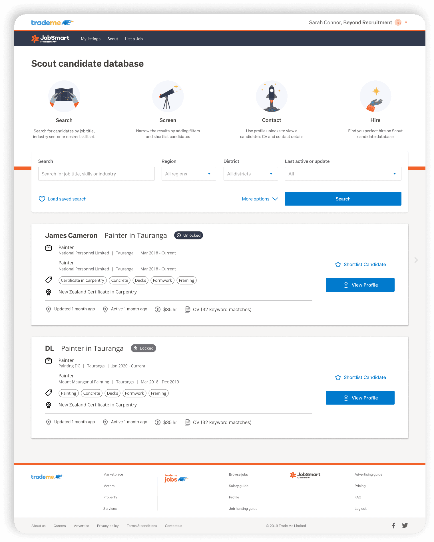
Unclear Value Proposition: Blue-collar advertisers were unsure why they should use the platform. Even with a low number of applicants, many believed it was the candidate’s responsibility to apply—not the employer’s role to search. The proposition was clearer for advertisers seeking high skilled blue collar workers (Painters, drivers, cabinet makers) or workers on the health care industry.
Navigation Challenges: Users found it difficult to navigate between the platform and the main Trade Me website and apps.
Terminology Confusion: The terms “updated” and “active” profiles were unclear, as both appeared to mean the same thing for the advertisers.
Outcome
These findings informed improvements in the onboarding experience, particularly within the job posting flow, CRM strategy, and platform navigation.
Our main goal became to create awareness about candidate database search.
Implementation & Monitoring
The implementation was rolled out gradually to a percentage of users, allowing the team to identify and fix any errors. My role involved monitoring the platform's usage through Hotjar, where we set up session recordings and surveys to gather feedback and track user behaviour.
Results
KPI Achievement: After iterating the pricing page, we successfully reached our target for the average ticket per customer.
Job Advertised Growth: After the release of the new job listing process we had a 12% increase in the number of jobs advertised.
Database Usage: 37% of users who advertised a job also accessed the candidate database.
Before
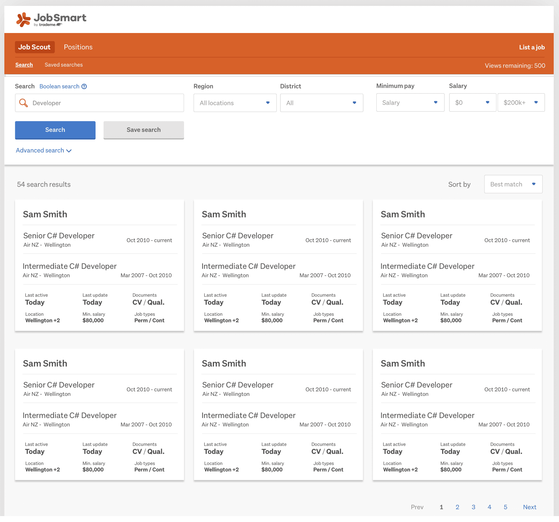
After
Key learnings
Team engagement: Engaging the team in the discovery phase helped them understand the value of the project.
User-Centric Research Drives Success: Conducting thorough research to understand user pain points and preferences is essential for creating effective solutions.
Iterative Design and Testing: Iterative usability testing and feedback helped refine design features and validate user needs.
Clear Communication Strategies Matter: Developing a strategy to communicate the platform's value to small businesses is key to adoption.